News
The Importance of Colour in Workplace Design
We’ve all been or worked in offices that are seas of beige or taupe: uninspiring locations decorated in bland colours where imagination and productivity aren’t connected concepts.
Thankfully, that’s not the case everywhere. Millions of companies across all sectors understand the importance of colour in the workplace, and its crucial function in not only defining a brand, but supporting its employees. It’s something we support them within our role as office design specialists.
In this blog, we’ll take a closer look at the latest trends, find out which colours bring out the best in people, and why using colour goes beyond what you put on your walls.
Why is colour important in an office space?
Anyone who has ever worked long hours in an office setting knows after a while, the surroundings can fade into the background.
In one sense, that can be sensible – who needs distractions when you’re nose-to-the-grindstone on a new project? – but those endless expanses of blank walls can also have the opposite effect, and make a work environment feel like an institution.
An increased focus on wellness as part of company culture and a greater understanding of the impact of colour has led firms, from the biggest brands to the smallest start-ups, to embrace colour as a way to communicate their company branding and boost creativity.
Trends in colour
In 2021, Ultimate Gray was one of Pantone’s two colours of the year. Yet when it comes to colour in office design, grey is increasingly being sidelined.
From bold statements to light accents, colours are making their way back into the office. Of course choosing the colour scheme is a major consideration.
Businesses want to find the right balance between maximising employee productivity and creating a comfortable and inspiring environment. That’s why they come to us.
Why is colour so important in design?
Colour has a powerful ability to affect our mood, and many smart businesses use it to define certain spaces within their office environments.
Working in an overwhelmingly white or neutral space can lead to feelings of sadness or depression among employees, making it more important than ever to introduce colour in office design.
We use complementary colours and shades in an office’s colour scheme to enhance a brand and show our understanding of the different ways a workplace environment can be used.
Conference rooms may be brightly coloured to inspire discussion or stimulate mental activity, while a rest area will be a lighter shade, encouraging staff to unwind and relax.
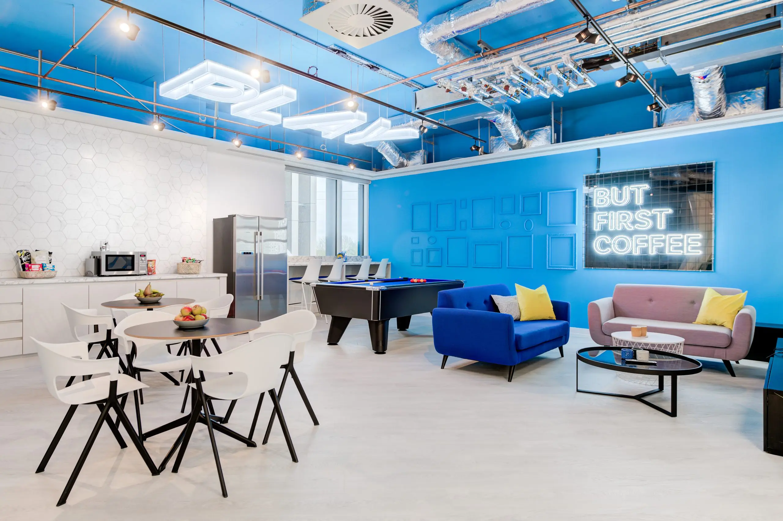
The colour blue
As the world’s most popular shade, blue is a calming colour, promoting thinking, creativity and performance.
Surprisingly it also has a positive impact on our health – it’s been found to lower people’s heart rate, breathing and blood pressure.
Psychologists and designers understand that blue is deemed to be non-threatening yet at the same time inspires confidence, making it a great shade to use as a large-scale background for office design and as a main colour scheme.

Green and all its benefits
It’s no surprise to learn the colour green can positively contribute to an office environment, reducing eye fatigue and helping create a calm, yet productive office.
Alongside blue, green is among the most popular colour choices for companies who want to create a soothing vibe for employees in their workspace when it comes to office design.
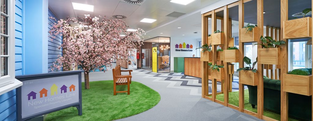
We combined several green elements for New Homes Law’s reception area, including a statement sofa, natural materials and lots of greenery to create an interesting yet calm space.
Accent colour in the office space
One of the most effective ways to breathe new life into an office design is by using accent colours, dashes of brightness that can help break up or bring warmth to larger areas covered in neutral or cool colours.
They may be just a touch here and there, but don’t underestimate the effect of an accent colour – that flash of energy boosts creativity, potentially providing visual stimuli that may lead to some great ideas.

Red
Best used in workplaces where there is lots of physical activity, or in furniture, red invokes feelings of warmth. However, too much red can have the opposite effect and cause some employees to experience headaches.
Yellow/Orange
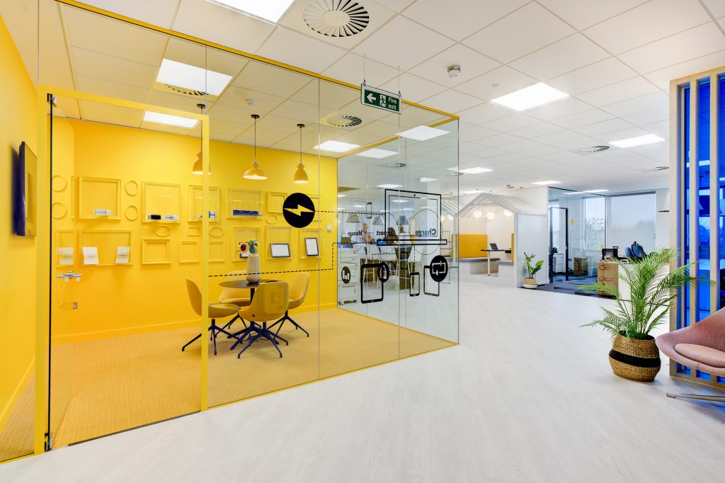
If you’re looking to use an optimistic colour as an accent in an office’s colour scheme, yellow and orange are ideal. They’re great for generating positivity and can work in great contrast to cool colours – a great example is Cambrionix’s all-yellow meeting room.
Of course, there is a balance to achieve in order to avoid over-stimulation with these bright colours, something our expert team of designers take into consideration when planning an office’s colour scheme.
Purple
As with blue and green, purple has no negative impact on employee productivity and works well with lots of other colours.
As well as generating a feeling of opulence and luxury, purple is also associated with wellness, and muted shades are perfect for use in areas where employees need to concentrate, for example.
Why is colour important in an office environment?
Colour in office design is crucial not only for branding, but also to create a space that’s productive, inspiring and will help connect people.
It’s also more than just paint – colour in the workplace can be introduced in lots of different ways.
There’s been a big shift recently toward the Memphis movement, an Italian design and architecture group founded by Ettore Sottsass which was very big in the 1980s.
Memphis put its colourful, postmodern stamp on everything from chairs to ceramics, and while it was described as “a shotgun wedding between Bauhaus and Fisher-Price”, it has become hugely influential in recent times.
Furniture
Every workplace, from the most conservative call centre to the funkiest office, needs somewhere for employees to work, eat, collaborate or relax.
The work from home trend prompted a shift from functional desks and chairs to items that are a little softer and come in a wide range of colours, as businesses try to make the workplace look and feel more homely.
Furniture is also a great way to add, as our Creative Director Zowie would say, ‘pops of colour’ to breakout or agile workspaces, whether it’s a bright blue or yellow sofa, or installing a rainbow bookcase, with each shelf dedicated to a single colour.

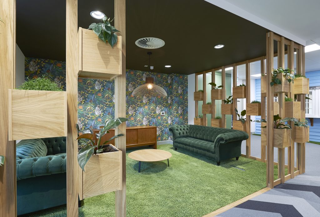
Greenery
Back in the bad old days, the idea of greenery in the office was a neglected ficus in the corner of reception, or a lonely spider plant on someone’s desk.
The world of office design has turned that page, and there’s much a much deeper understanding about the impact of nature’s colours on employees’ mental and even physical health.
Known as biophilia, it’s the art of bringing the outside in for an office workplace, and can be anything from towers of plants to divide spaces, floor-to-ceiling images, or even a synthetic lawn, for example, as part of a soothing and calming office colour scheme.
Art
Lots of companies use art to bring more colours into their workspace and many are becoming increasingly inventive at doing so.
A good example is our project for ALPI UK, which turns a line of doors into a piece of art.

It links back to the Memphis movement and one of the biggest design trends of the moment: painting arches or geometric shapes in different colours on walls.
Not only does it create a visual impact but it can also add depth and texture to flat surfaces, making a bare space a whole lot more interesting.
It’s also a simple and effective way to introduce an accent or mix in your brand colour and can bring a whole new energy to a space or room.
Lighting
Unless your office design is deliberately post-industrial, it may be time to rip out those harsh overhead lights.
These days, lighting has become a crucial part of office interior design with a key role to play in creating a productive yet harmonious environment.
Our work for Yewdale showcases the fun you can have with lighting, from criss-crossed striplights to the softer, more homely fittings in the communal kitchen, tapping into the ‘resi-mercial’ trend.

Of course, coloured lamps and shades are a fun way to add in the accents of different colours that take a bland office to a vibrant place to work.
Helping our clients understand the importance of colour
Colour is a crucial element in office design. A sterile workplace not only has a negative effect on everyone’s mood and wellbeing, it could also be a drag on productivity.
By the same argument, an office that is a riot of colours runs the risk of over-stimulating both staff and clients.
Companies want their offices to be more than just a showcase for their brand identity: they want to create comfortable, productive spaces for all employees, particularly those who may be wired differently – whether they need access to calmer, quiet zones or somewhere to regularly let off steam.
Our experts will work closely with you to define your design vision, including a cleverly thought-out colour palette, then seamlessly convert those designs to a living, breathing reality. Call us on 01245 320900 or use this contact form.