News
Colour Psychology in Office Design

Sometimes you can’t quite put your finger on it. But in truth, colour is influencing you, in every aspect of your life.
Have you ever wondered why certain colours appeal to you more than others?
Why you recoiled in horror from the fuschia shade your sister picked out for her bridesmaids’ dresses, whilst the other girls looked categorically gleeful?
Why you argue aggressively with your partner over what shade to paint the bathroom, you in favour of duck egg blue, and them championing a sort of peach?
Why a certain shade of tangerine evokes a foggy memory of a beach holiday from childhood, reminding you of the smell of sunscreen and warmth of sand on your feet?
Influential psychologist, Carl Jung, described colour as “the mother tongue of the subconscious”. It has the power to lift your mood, alter your productivity, and even make you feel agitated and unsafe. In the modern world, understanding the psychology of colour is becoming increasingly important. Colour in office space interior design can be the difference between a client sticking around long enough to make that sale, or alternatively feeling uneasy in a space. It can be the difference between your employees feeling energised and inspired, bouncing around fantastic new ideas, or feeling over-stimulated and distracted.
The Human Experience
The manner in which we as humans experience colour, can be categorised in three main ways.
Innate and biological response
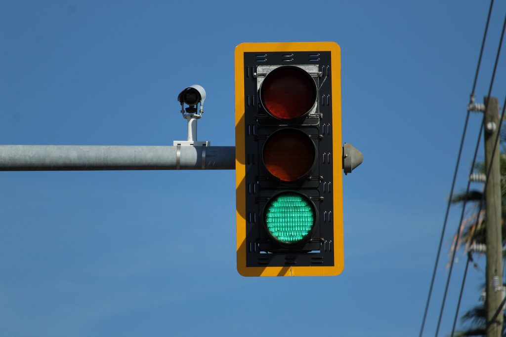
Colours fall on a spectrum of wavelengths, and we physically experience them in a similar way to how we experience sound. For example, red has the longest wavelength of all the colours. It appears closer than it actually is, demanding our attention first, hence its use in traffic lights, brake lights on vehicles, and warning signs. The concept of red signifying a hazard or emergency in the present could also be linked to primitive humans associating red with the sight of blood, or fire.
Cultural association: This man-made response to colour can differ across nations, religions and eras. Cultural connotations are thought to originate when an influential person or body, such as government or royalty, assign a colour a specific meaning, and over time, this infiltrates folklore. For example, in China, red is considered the colour of good luck and prosperity, whereas in Ireland, it is green. Think about how the modern western world has dubbed pink as an overtly feminine colour, and blue a masculine one. This wasn’t always the case! The idea has evolved more recently, driven by 20th century gendered consumerism.
Emotional and personal: Karen Haller, author of The Little Book of Colour, explains how colour is a “physical thing, but becomes emotional, as it moves through the part of the brain, the hypothalamus, which governs appetite, sleeping, our nervous systems…” Colour is evoking a specific physiological response, which in turn, produces a psychological reaction in the brain. Humans have the capacity to hold a particular emotion within a colour; subconscious recollections of a particular colours’ presence in our memories, could be to blame for our aversions and inclinations towards certain hues in the present day. This can make our reactions to colour subjective and personally-motivated, which can pose a problem when attempting to design a universally-appreciated space.
Colour In Office Design
Suzie Rumbold, previous President of the British Institute of Interior Design, describes colour psychology as “the study of hues as a determinant of human behaviour and perceptions… It is very influential at the moment in product branding, retailing and the design of interiors for residential and commercial spaces.”
Choosing the right colour goes beyond personal preference or the aesthetic surface appeal, and understanding our reactions to colour can help us make better decisions about it in design. Good news, you don’t need to panic! Put down the colour flipbooks, and library books – there is no need to frantically understand these nuances yourself! The mysteries of colour psychology have been carefully studied by the team at Spacio – we have done the hard work for you!
There are positive and adverse traits of every colour, but bold, bright colours really needn’t be feared! Many offices are tending to stick to ‘safe’ neutral hues, but this is not always the best approach for your business. A recent University of Texas study actually found that overly grey, beige or white offices led to employees showing increased feelings of sadness and depression, in comparison to their more colourful counterparts.
Colour is considered a valuable secret weapon by our interior designers. When crafting designs at Spacio, we consider deeply what your business or brand represents, the intended purpose for a space, and how colour, amongst other design traits such as lighting, textures and furniture, can cultivate a feeling.
We are confident that we can harness the positives of colour in a way that will enhance your business or brand, motivate your employees and engage your client base!
Designed by Spacio
Here are a selection of our designs that we believe highlight how colour can be used for good!
Breakout with Blue
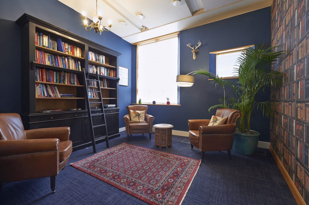
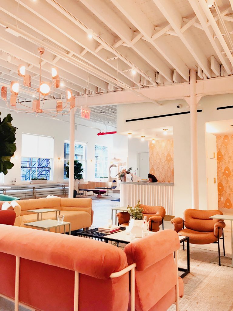
The star of Samsung’s palette is, without doubt, this big, beautiful, deep navy blue, which causes these breakout areas to ooze sophistication and relaxation. Loyalty, success, and peace, are all connotations of this bold shade. It is thought that blues can even help bring down blood pressure and slow the heart rate, having a calming effect on those that encounter it. Some shy away from red, as it is a punchy powerful colour with many associations; but minimal use, in the form of soft furnishings, can emote strength, excitement and passion. Here paired with earthy, natural brown leather and wood, we have created a traditional, luxurious finish – just perfect for a break.
Lemon Brings Light
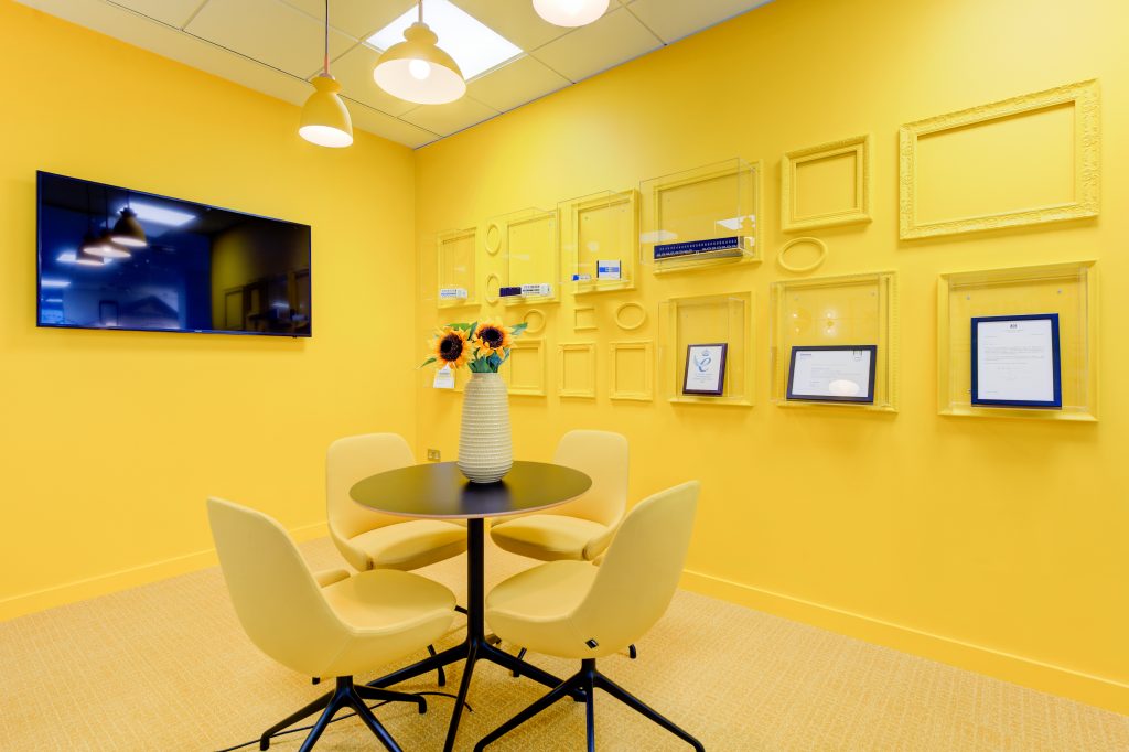
For Cambrionix, unapologetic use of yellow for this meeting room, provides a streak of sunshine in a corner of the office furthest away from natural sources of light. Often associated with optimism, intellect and energy, the light lemon hues also provide a stark visual contrast to the bright blues used in the office break out area. Contrasting colours can assist your staff’s mental transition between focus and relaxation throughout their working day, which will ultimately boost overall productivity. Clever, right?
Playful in Pink
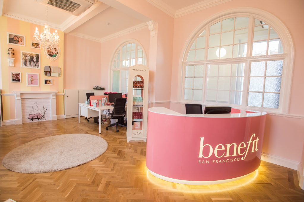
Pale pink hues encapsulate the values of Benefit Cosmetic’s iconic brand in their classy and understated reception area. Associated with femininity and youth, pink can demonstrate playfulness, soft warmth and romance. The natural light wood floor adds an extra sense of comfort, and stability, giving this greeting space an instant homely and safe feel, and creating a winning first impression with visiting clients.
Greeting with Green
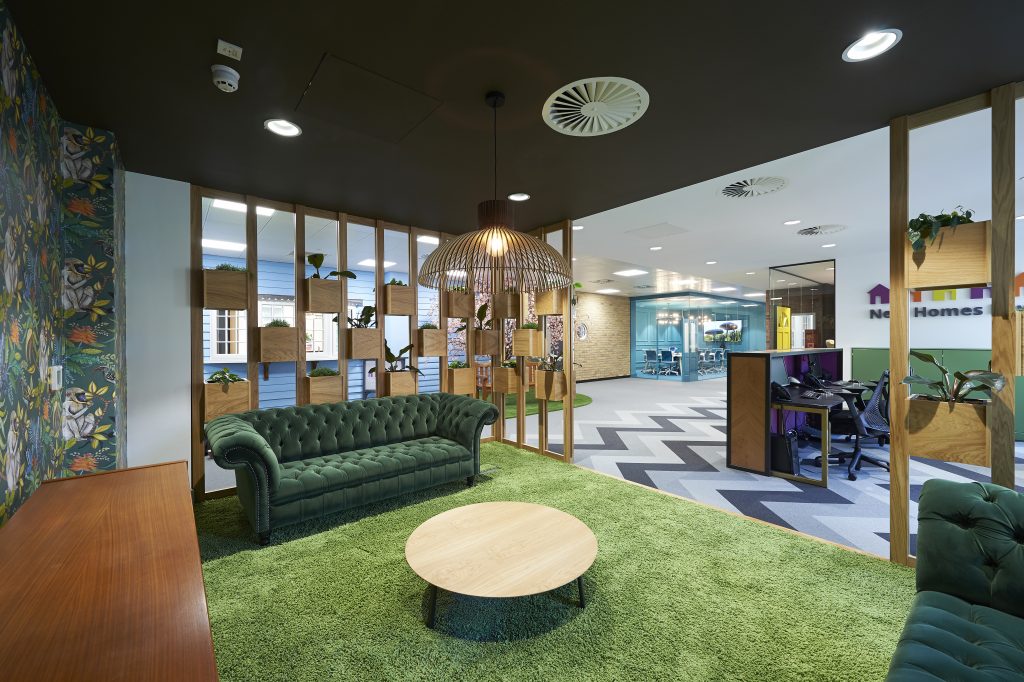
This New Homes Law’s reception area effortlessly embodies elements of biophilic design. The green palette conveys balance, growth, nature and restfulness. Sky-blue wall panelling paired with a grass-green carpet replicate an unmistakable sense of nature indoors. As city-dwellers spend more time in greying urban settings, and less time in natural surroundings, we are seeing higher levels of stress and depression amongst our workforce. Natural hues of short wavelength colours, such as mentally-soothing blue and green, can help to combat this. The elegant forest green velvet sofa, vibrant jungle print wallpaper, as well as actual foliage, all work in tandem to connect us to the natural world in this dreamy design.
Check out more of our designs on our Projects page!